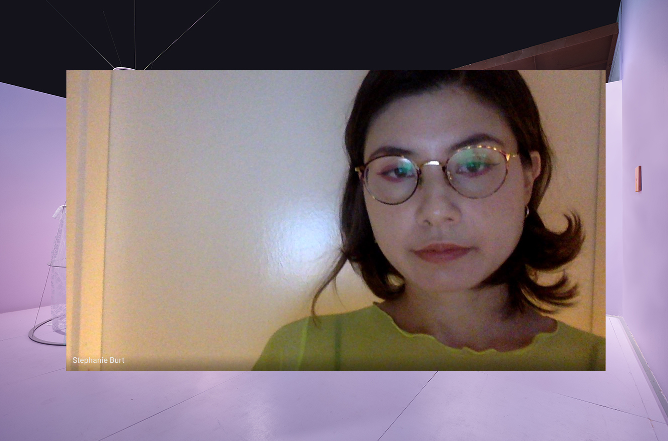
Stephanie Jane Burt is an artist whose practice spans from sculptural installations to fictional prose. She completed her studies at Glasgow School of Art, where she received her Bachelor of Arts (Hons) Painting and her Master of Fine Arts. Her work invites the viewer to explore dialogues between her installations and their settings through a fictional narrative at times referencing film and literature. Her research looks across feminism, gender, an analysis of girl culture and the nouveau roman. She recently completed a residency at ISCP New York in 2019 and has started a research project, A Stubborn Bloom, which explores representations of femininity within fashion, film and material culture.
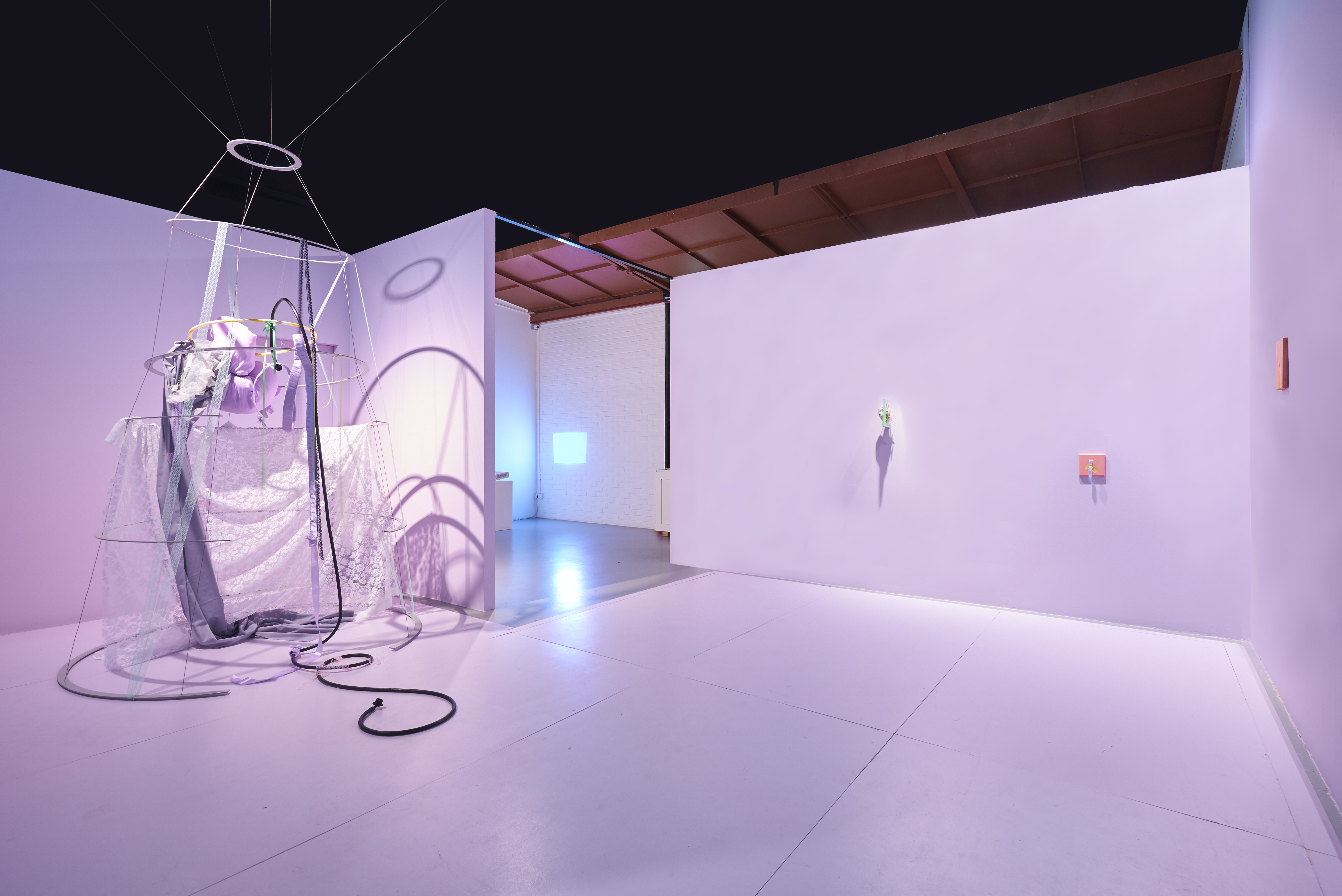
A large crinoline sculpture with materials delicately hung and draped. Small frames that have been punctured or bound together. Stephanie Jane Burt is well aware of the power of the materials she uses, and how the relationships between them can evoke a thousand and one different possibilities. Her recent exhibition at Yeo Workshop, What is the current that presents a behaved waist, was an embodiment of these ideas. Materials and objects are rich repositories for Stephanie, and through her imagination, they coalesce into worlds.
A large crinoline sculpture with materials delicately hung and draped. Small frames that have been punctured or bound together. Stephanie Jane Burt is well aware of the power of the materials she uses, and how the relationships between them can evoke a thousand and one different possibilities. Her recent exhibition at Yeo Workshop, What is the current that presents a behaved waist, was an embodiment of these ideas. Materials and objects are rich repositories for Stephanie, and through her imagination, they coalesce into worlds.
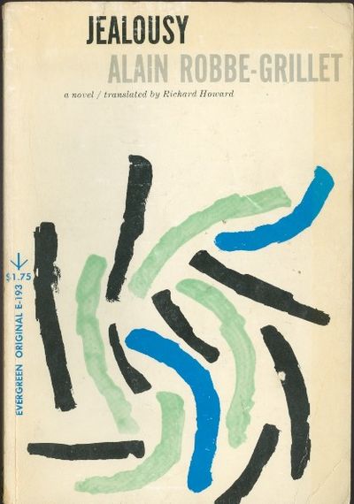
¹ Jealousy (La Jalousie), Alain Robbe-Grillet
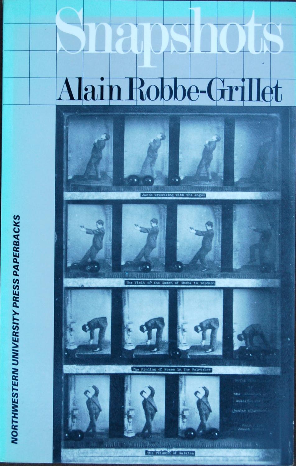
² Snapshots (Instantanés), Alain Robbe-Grillet
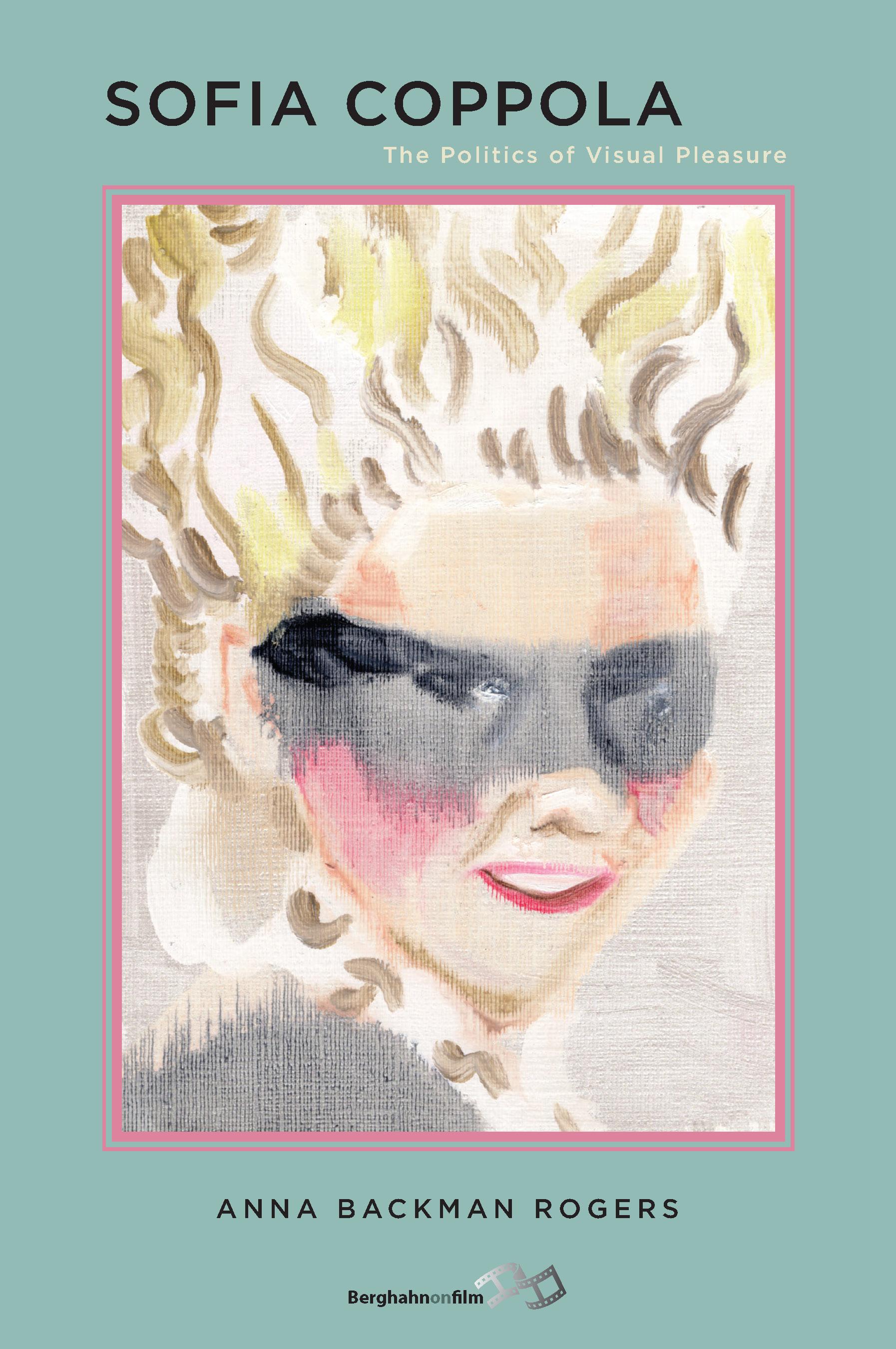
³ Sofia Coppola: The Politics of Visual Pleasure, Anna Backman Rogers
For your selection of artworks, you’ve picked out films, books and books on films. Tell us about how you put this selection together, and why films and books came to mind as such prominent sources of inspiration for you.
Looking back at when I started my practice eight years ago, and the research interests I’ve always had, I always begin with literature first. Literature and film were my first loves, but I think I started with literature as my main angle of research. From there, I execute my work or it comes out in the language of sculpture. I studied painting, but I eventually moved into sculpture. When you look at films and books I picked out — Last Year at Marienbad and Alain Robbe-Grillet’s books, Jealousy and Snapshots — they all revolve around this idea of not following a linear plot line. They portray this interior landscape by describing things that seem superficial or that only seem to exist on the surface. These works don’t follow the usual trajectory of a novel where there is a start, a middle, and a finish. Alain Robbe-Grillet is known for doing the screenplay for Last Year at Marienbad, and in that film, nothing really happens. It is through an in-depth description of detailing or about the atmosphere that viewers are able to get a sense of what the characters are feeling or experiencing. His short story in the book Snapshots titled The Dressmakers’ Dummy essentially just describes this table and all these objects around the table. The point he is trying to make is about perception and how we look. You realise that there's an intensely voyeuristic quality to it, to the point where it can be almost read as threatening. I was very interested in how these normal, mundane objects became so loaded. How could something we see every day — a table — become so frightening?
When you watch Last Year in Marienbad, all the characters are trapped in this hotel. The hotel is a very bourgeois one, and in the movie, we see one of the male characters trying to convince the female character that he met her last year at Marienbad. Essentially, the whole thing circles back and forth as the characters wander through this hotel. The camerawork constantly pans towards the detailing of ceilings, the architecture, and even the objects in the room. The way in which the corridors are shot really give the viewer a sense of how the characters’ interior landscape might look like, and I found that fascinating. A few years ago, I curated a show based around this film at the Institute of Contemporary Arts Singapore. With the exhibition, we all got a chance to react to the film in our own way. The film is so multi-layered and so multi-dimensional, yet at the crux of it, the film revolves around the quality of looking.
Looking is central to another story in Jealousy, where this man spies on his wife and the whole story is told from his perspective — how she sits on the porch or how the hem of her dress falls. It’s through this constant description that you realise, as a reader, that this man is rather obsessive or intrusive. There’s a frightening figure here who’s constantly describing what he sees, and there’s no overt mention of his emotions — but that’s not necessary either. You’ve already formed an image of him in your mind. After a while, I began to realise that the way in which I assembled my sculptures and my installations were also centred around such ideas about looking. If you look closer at my installations, you will see like a lot of very small little details that will otherwise go unnoticed. I like or want to play with the tension between the materials and how they can convey some form of emotional state.
Finally, I just opened a show based on Albert Hitchcock’s Vertigo and Sofia Coppola’s works. I think it fits in very much with the research I’ve been doing for a long time around gender dynamics and the power relations between the two genders. For a previous solo showcase of mine, O Dear What Can The Matter Be, I based it around a short story titled The Yellow Wallpaper. That exhibition was interested in the struggle between the two genders, particularly when you consider power relations and dynamics. This interest draws me towards Alfred Hitchcock’s Vertigo. Anna Backman Roger’s book on Sofia Coppola really fits into a lot of the frameworks of research that I've been looking at. A lot of people dismiss Sofia Coppola’s films as being frivolous, but Anna Backman Rogers breaks down Coppola’s films scene by scene to analyse them. The power of Sofia Coppola's work is its visual language and how she tries to reclaim this femininity. Coppola provides a different perspective to the interior landscape of a teenage girl, and this is particularly evident in films such as Mary Antoinette or The Virgin Suicides. The main protagonist in these stories are teenage girls. When you actually watch The Virgin Suicides, there are a lot of frames where you see the dressing table or the tampons in the cupboard. After awhile, you start to realise that the film centres around this rite of girlhood. Although the film is set in an American context, there are so many points of affiliation throughout the film for female viewers.
I really wanted to pick up on the way in which you work with materials. You’re not just thinking about the kind of objects you use, but also about the objects’ physicality, materiality, or the relationships they can share when you place them side by side. There are so many ways in which materials can come together, fall apart, or create this tension that you speak of. Is there something that, you would say, binds the way in which you work with materials?
When I first started working with materials, most of the items or objects I worked with were abandoned or scrap material. If you look at the works I made before coming back to Singapore and the works I made after coming back to Singapore, there’s a marked difference. The former has an element of rawness to them, and the latter feel a lot more finished. This probably comes down to the sort of materials I had access to in these different places.
When I was in university, I started going out into the streets to collect materials for my work. I’d bring them back to the studio and begin repurposing them. Most of the time, these materials would be abandoned. That was something that I was thinking about a lot at that point in time — this idea of reconstitution or giving these materials a new lease of life. I also came to realise that I was drawn towards picking up the sort of materials that usually go unseen. For example, when you build a building, there are materials such as wire mesh or the outer casing of a pipe that hold up the building or come in between the interior and exterior structure. Most of the time, these are materials or objects we don't necessarily see. They're usually never even thought about. I noticed that most of the materials I picked up were these things — things that were known to hold the buildings together or in place. I started off with this language, and over time, it evolved to include fabrics, and the lace, and ribbons. I really like this idea of reading an artwork from multiple points, and working with things that often go unnoticed. Fabric, thread and ribbons hold things together. Yet, we don’t always think of them as something that’s incredibly important.
Maybe less so now, but when you think of a sculptural practice, the thing that comes to mind is, for example, the casting of large chunks of concrete. I don’t create these large, solid masses. My works are usually rather light, fragile, and they look like they're about to break apart. I think that creating or recreating the little things that hold things together and reconstituting them in a different language opens up a new way of looking or new way of conversing with them. You can, of course, go into the connotation of each small item I’m using in my works. That’s just another reading of my work.
A good piece of work has multiple entry points into it, so I think that’s really important.
Some people approach my works through the narrative that I create, and some people read the works through its material language. Either way is fine. Eventually, the viewer gets to the same place in terms of seeing the fragility or danger in the works.
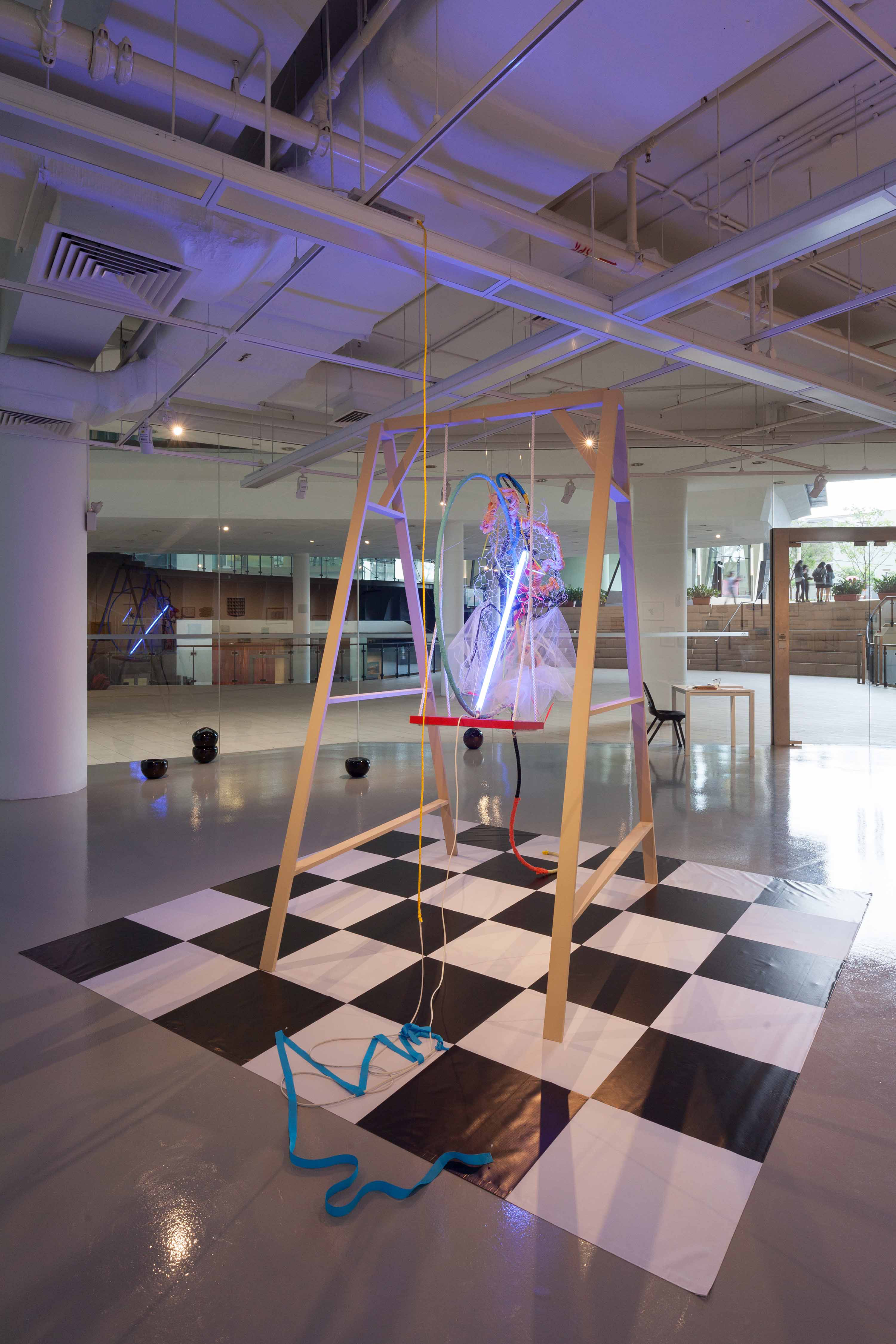
⁴ Suspect A, X, Stephanie Jane Burt
2017, Installation View at Institute of Contemporary Arts Singapore
2017, Installation View at Institute of Contemporary Arts Singapore

Ideas of fragility and tension are indeed communicated to those who encounter you works, and that could perhaps be attributed to the style in which you work in. How would you describe the role of style in your practice, and what does style mean to you?
Going back to what style is for me, I’m very attracted to things that have a very feminine quality to them. Having said that, I try to position these things in a different way and so they aren’t thought of as weakness.
For instance, let’s look at the colour pink. Most of the time, the colour pink is associated with femininity and weakness. In a book by David Batchelor titled Chromaphobia, the author talks about pink as a dizzying colour. It’s meant to throw you off. What’s more interesting for me is turning these ideas on their head. To me, style is usually something that is defined by the societal norms of the time, and the colour pink is just one such example.
I've seen artists who create these soft-looking sculptures out of hard, sturdy materials. I think it's about repositioning the idea of what is the norm, or the associations that certain objects or colours have. That’s how I interpret style, but stylistic measures mean very different things to very different people. We can also speak of style in terms of questions such as, “are you a Maximalist?” or “are you a Minimalist?” That’s another possible discussion, but I don't think that relates to how I define things or what it means to me. For me, it’s all about interpreting things in a way that’s unexpected. In the exhibition O Dear What Can The Matter Be, the installation was situated in an entirely yellow space. Yellow is usually regarded as a sunny and bright colour. Yet in the context of the exhibition, it became this frightening, nauseating, almost disgusting colour. It definitely was not bright and happy, and I'm interested in in creating that sort of tension.
Vertigo, Directed by Albert Hitchcock
1958
1958
Let’s talk about how the gallery spaces in which your solo showcases have been held. In your current exhibition, the walls are painted a pastel lilac hue; but as you said, in O Dear What Can The Matter Be, the walls were painted a bright, almost sickly yellow colour. Do you see these interventions into the gallery space as an extension of your work, or a complimentary feature that’s just a good thing to have with further teasing out the works’ complexities?
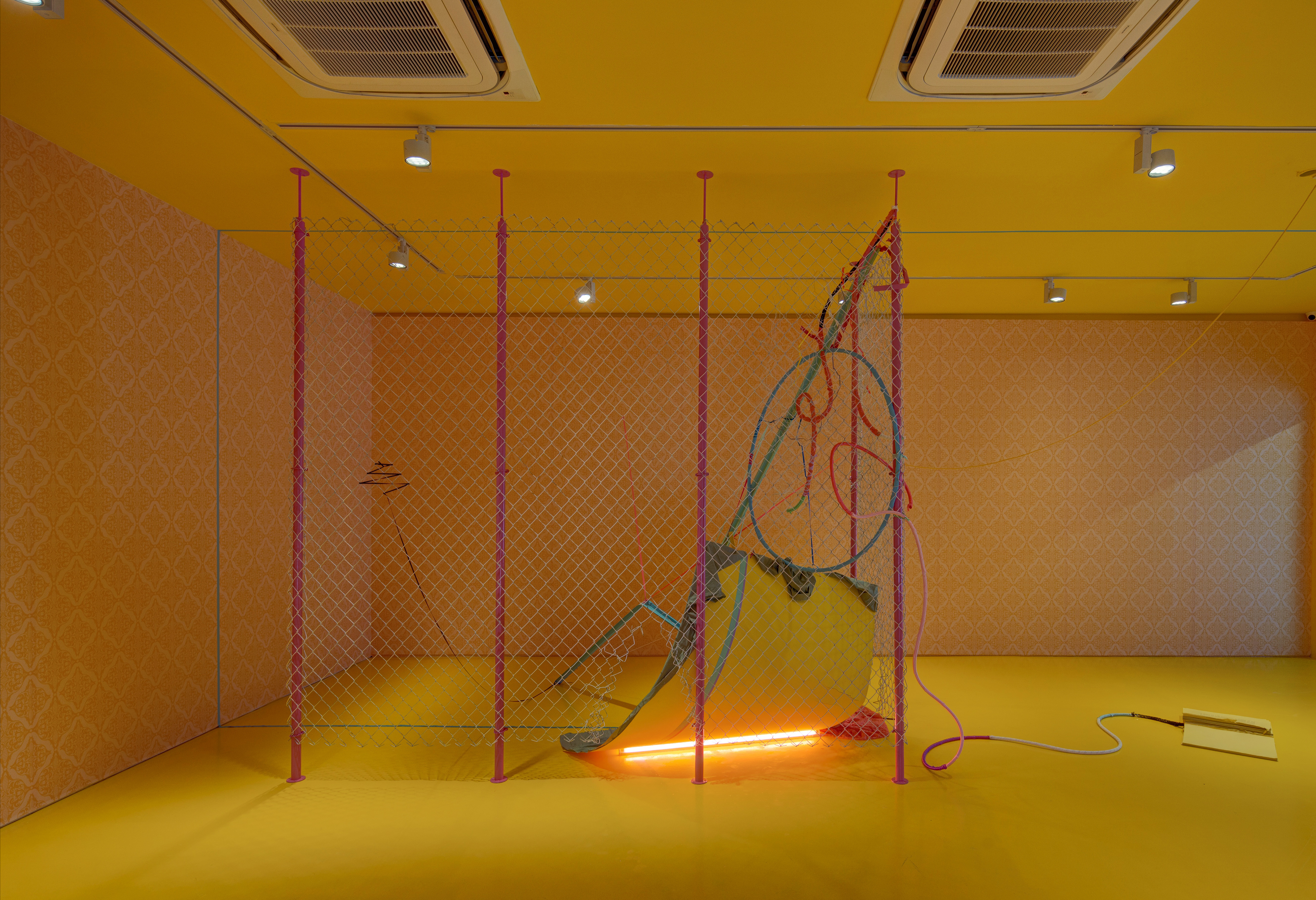
It's very important to the work. It is very, very, very important. I don’t see it as complimentary at all. It is part of the work. It's very important for me to create an immersive space where the viewer steps in and is immediately aware of the transition from one space to the next. Colour is one way of doing that. As an artist, taking over the space is very different from enveloping the viewer within the space. For O Dear What Can The Matter Be, I wanted to create a space that resembled yellow bedroom. This explains why there was yellow wallpaper in the space, because in Charlotte Perkins Gilman’s story, the protagonist is trapped in this room whilst her mental state slowly disintegrates. These details were important and they helped to emphasise this idea of isolation and claustrophobia. When you step into the gallery, you can begin to feel the sort of anguish the protagonist felt just through the atmosphere created.
In the current show, What is the current that presents a behaved waist, this takes on a conceptually different place. In Alfred Hitchcock’s Vertigo, the character, Judy, is often eclipsed. She wasn't really talked about. What I was trying to do was to provide a feminist reinterpretation of the film by talking about what I would have liked for Judy, or what would I have liked her character to be. Instead of recreating the way in which the story pans out, I wanted to present a perspective that asks — Okay, what would it have looked like if Judy had more of a voice? When I was talking to the curator, Samantha Yap, she asked me, “Well, what would you have liked for Judy?” I would have liked for her to walk away from that, or have the freedom to walk away from all that. Having said that, we didn’t want to just narrate the story. This exhibition speaks to my hopes for these characters, and that differs quite a bit from the previous exhibition we were discussing. In the film, there is a scene where Judy is bathed in neon green light and wearing a purple dress. That’s the point in time she decides to fully embody the character of Madeleine. I was incredibly drawn to the colours used and the contrast it created. Green is almost situated as Scottie’s colour, or the colour of transformation, and it’s quite scary. Judy, however, is in a purple dress. I wanted to invert this situation by decking the whole space out in pastel purple instead.
Yet when you walk around the show, I think viewers still get a sense of the fact that Judy still doesn’t feel very free. This is especially when you encounter the crinoline structure and the tension between the materials used. If it isn’t possible to be freed from a patriarchal society, what then is the next best alternative? How can we navigate between constraint and freedom? I wanted to discuss how we could live within these structures in a healthier manner, because it's going to be very hard to be freed from patriarchy. Of course, that’s my hope for a utopian world. But if I’m going to be honest and realistic about this, we need to be able to manoeuvre this dynamic in a healthier way. and try to live it in a much more healthier way. Instead of freeing Judy, or in order to free her character, we need to begin by looking at how they got there in the first place and the sort of turmoil they went through. In a way, the turmoil might not be something that you can ever truly be free from. All of us struggle with trauma and being freed from it. It’s never going to be a clean slate, but you can make the choice to live your life in a healthier way. The show tries to illustrate Judy through this perspective.
⁶ O Dear What Can The Matter Be, Stephanie Jane Burt
2016, Installation View at Yeo Workshop
2016, Installation View at Yeo Workshop

Another thing that stood out for me with What is the current that presents a behaved waist was the difference in scale. You’re known for creating works that are larger and more monumental in size. Yet in this show, we see smaller canvases alongside the large crinoline sculpture. What is the relationship between the two, and how do you approach questions of scale in conceptualising a work? ls this something you decide on from the get go, or is this something that develops as you collect or gather materials for a work?
The scale is really important, and this happens right at the beginning of conceptualising a work. When I go into look at a space, I think about things such as the spatial layout. For O Dear What Can The Matter Be, the gallery space was quite enclosed. In that way, I was able to recreate this idea of claustrophobia in a very strong way. In comparison, the space for my current exhibition is rather tricky to work with. I was quite apprehensive at the start because the ceilings are very strong, they were painted black, and they're quite high. Already, the structure of the space itself was quite strong.
I created a distinct floor space so that when viewers step into the gallery, their focus is brought to the ground and they become aware of how they’re stepping into a different space. It almost feels like a stage, and I think that distinction was very important. The crinoline was made high, and it was made high because I wanted it to look almost overpowering.
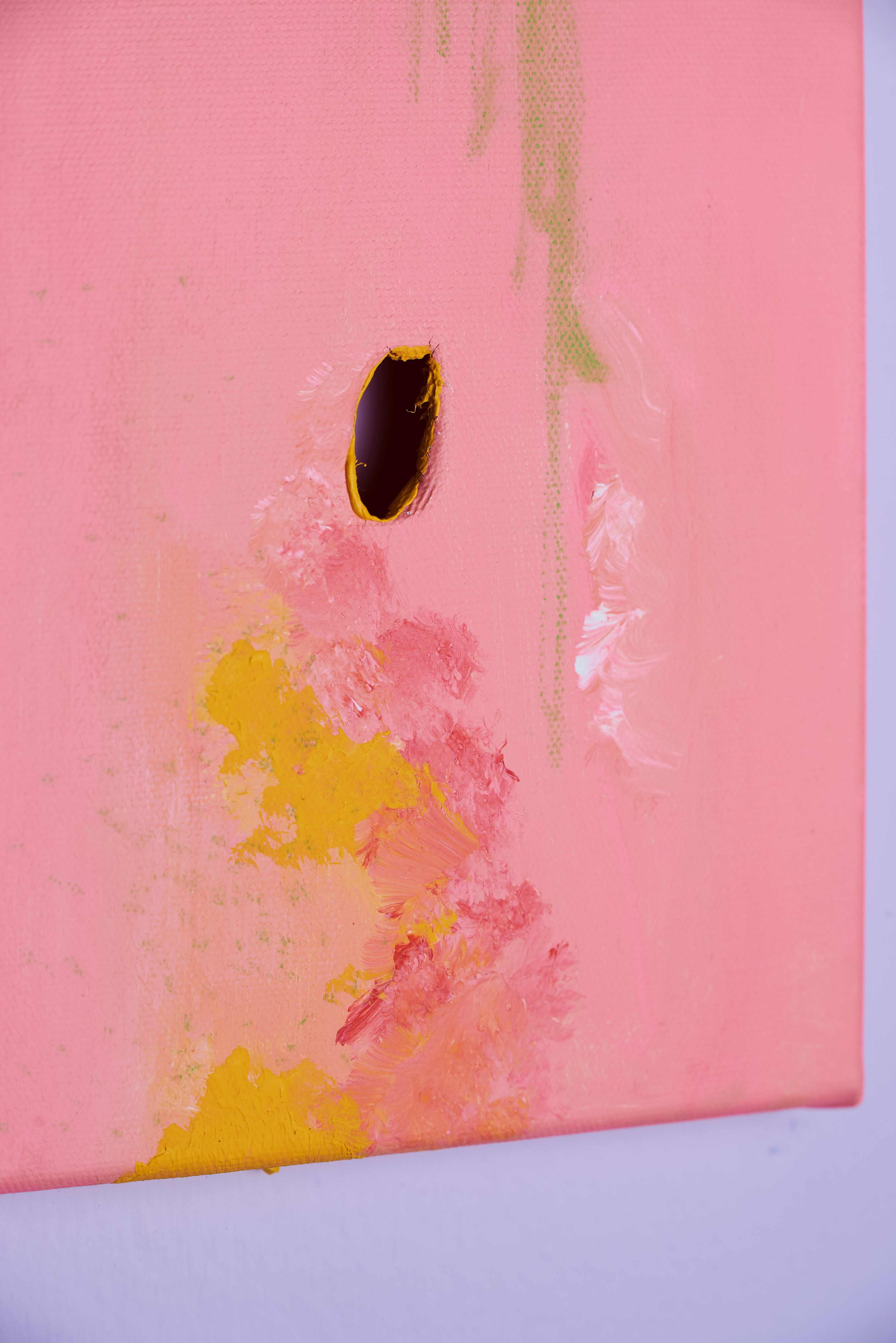
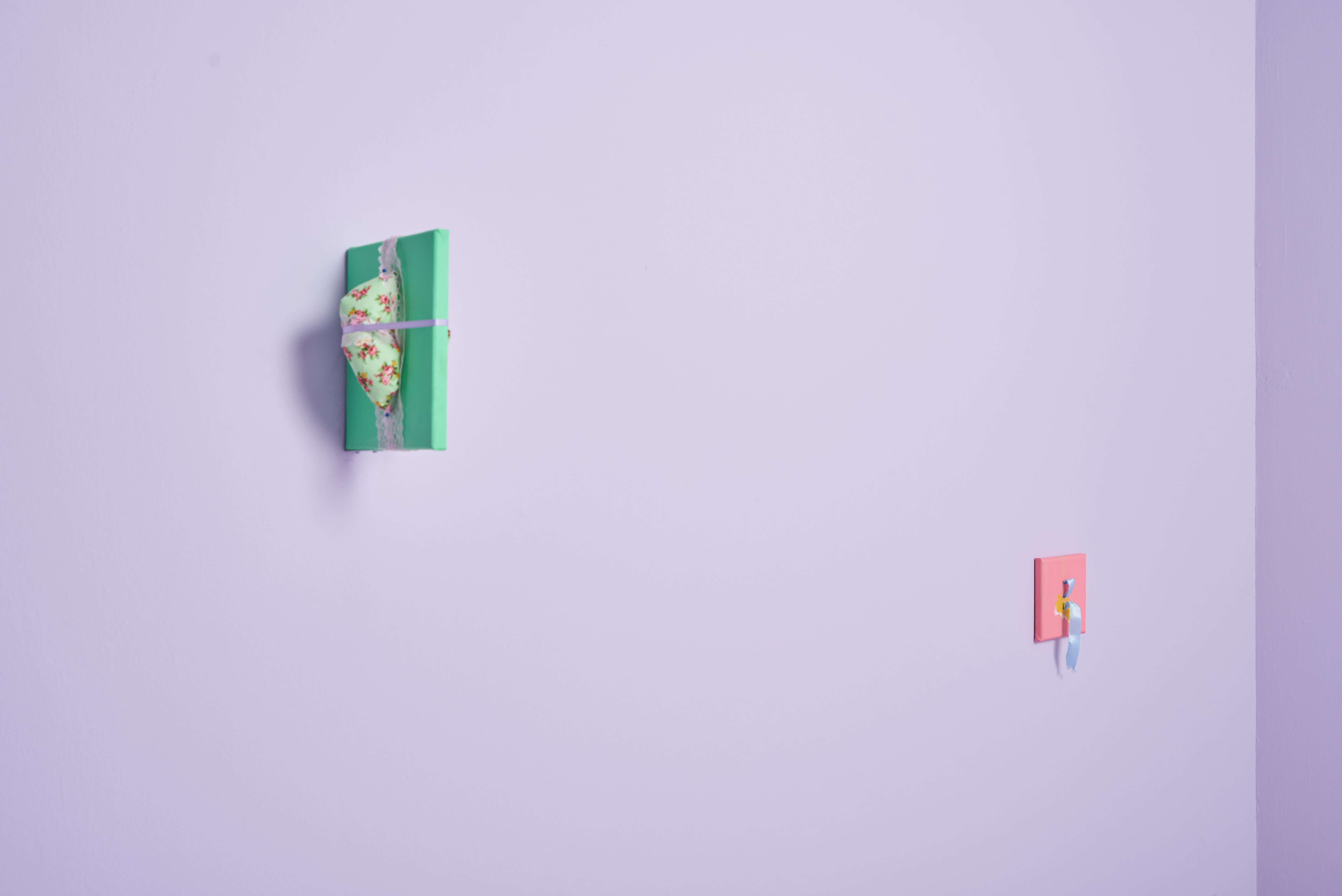
The smaller canvases, on the other hand, are very, very new. I've never really done something like that before. It almost looks like a small little painting or sculpture. I actually wouldn't call it a painting — it's more of a sculptural item. These three canvases are interested in questions such as, how do you turn a hard surface soft? Well, you puncture through it. I really wanted to use something very modular and very small to convey ideas of harshness and softness. In that sense, they’re very closely related to the crinoline structure, where the structure consumes and reveals objects at the same time.
I think the small little canvases do employ the same kind of language as the bigger one. When the show was slowly panning out, it soon became evident that I had to make works that were in dialogue with the larger crinoline sculpture. I wanted to form this discussion within the space, and that’s why I made these smaller canvases. When I was making these works, one thing that remained constant was the fact that I was sewing things together and using materials such as ribbons. I found it very interesting to see how my installations relate to like smaller works, and how they would converge in the space of a gallery.
I created a distinct floor space so that when viewers step into the gallery, their focus is brought to the ground and they become aware of how they’re stepping into a different space. It almost feels like a stage, and I think that distinction was very important. The crinoline was made high, and it was made high because I wanted it to look almost overpowering.
The smaller canvases, on the other hand, are very, very new. I've never really done something like that before. It almost looks like a small little painting or sculpture. I actually wouldn't call it a painting — it's more of a sculptural item. These three canvases are interested in questions such as, how do you turn a hard surface soft? Well, you puncture through it. I really wanted to use something very modular and very small to convey ideas of harshness and softness. In that sense, they’re very closely related to the crinoline structure, where the structure consumes and reveals objects at the same time.
I see these smaller canvases as windows, and these works all touch on the tensions between emerging and withdrawing, constraint and freedom.
I think the small little canvases do employ the same kind of language as the bigger one. When the show was slowly panning out, it soon became evident that I had to make works that were in dialogue with the larger crinoline sculpture. I wanted to form this discussion within the space, and that’s why I made these smaller canvases. When I was making these works, one thing that remained constant was the fact that I was sewing things together and using materials such as ribbons. I found it very interesting to see how my installations relate to like smaller works, and how they would converge in the space of a gallery.
Last Year at Marienbad, Directed by Alain Resnais
1961
1961
Let’s turn the conversation to your interest in fashion, which is something that comes through your selection of the film, Last Year at Marienbad. The film features costumes made by Coco Chanel, and they add an incredible textural richness to the film. I understand that you have a deep interest in fashion. Fashion is something that many of us are familiar with, but might not often consider as academically or historically significant. Could you tell us about what your own research interests are rooted in, and whether you see this clothing the way you work?
It’s so interesting to think that Coco Chanel created costumes for this weird, surrealist art house film. It blew my mind, and it made me think about how artistic interests might have overlapped during that particular period of time. When we think of fashion today, we think of powerful and large fashion houses. Yet you see Chanel designing clothes specifically designed for this character, A. The character herself is an elegant and sophisticated lady, but at the same time, she's so sad. She’s almost withering away, and if you start analysing her costumes, you begin to see this very clearly. I just think it's really fascinating how costumes or fashion can mirror the interior landscape of a particular character.
To me, fashion is essentially about the body. The body in terms of how it clothes, protects, or reveals. That, in and of itself, is expression. I spoke about my interest in materials earlier, and my interest in fashion comes from that same place. Essentially, I’m interested in the body, how the body moves, and how the bodily exterior body can convey the emotional interior. Usually, clothes are a vehicle for communicating those ideas.
If you look at the works of Rei Kawakubo, for example, it is undeniable that she's making sculpture. I saw an exhibition of hers, and I was just so blown away. Her works might not look like mass fashion, but they are created in such a way that you can feel her angst or her anguish. I was so moved by this exhibition that I cried. I never knew that I could feel this way looking at the work of a fashion designer, and so that’s how it began for me. I started to look at clothes as sculpture pieces.
⁸ What is the current that presents a behaved waist, Stephanie Jane Burt
2020, Installation View at Yeo Workshop
2020, Installation View at Yeo Workshop
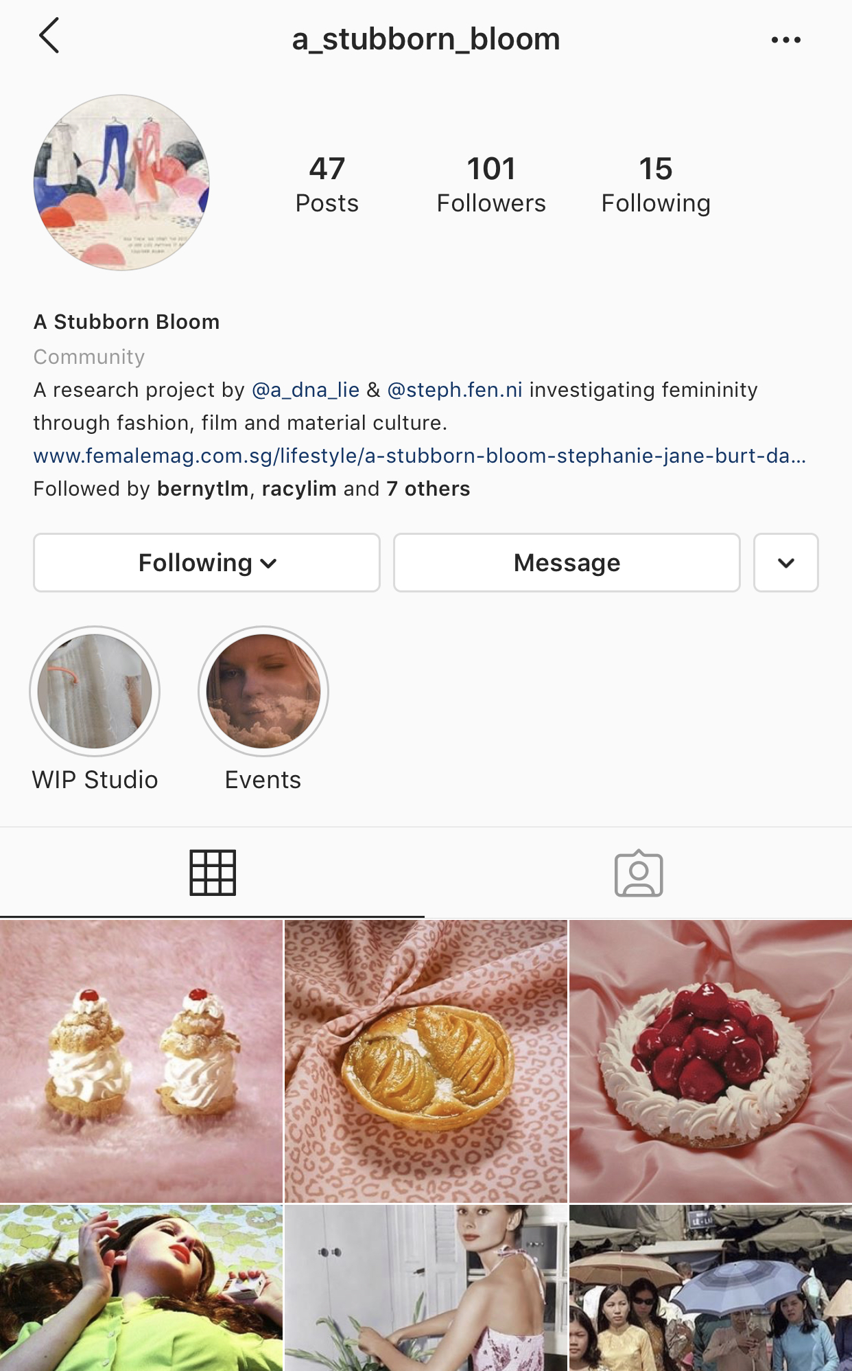
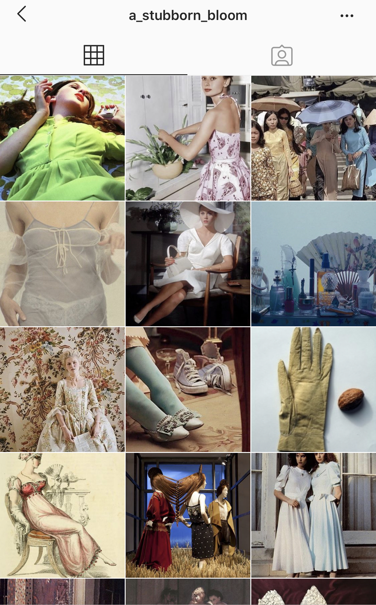
On that note, tell us about the project you’re currently working on alongside Daniela Monasterios Tan, A Stubborn Bloom. How did the idea for the project come about, and how did both of you settle on Instagram as a suitable outlet or medium for exploring these research interests?
We just wanted an accessible platform where we could dump all our research into. Instagram is something that a lot of us are using now, and this project started through a conversation I had with Dani about the book by Anna Backman Rogers. We were talking about femininity and how it’s been misunderstood, but we were primarily looking at it through the lens of film. After a while, we came to the conclusion that we work on something together. We also come from quite different backgrounds. I come from a fine arts background, and she's trained in fashion, but I think our research interests overlap quite a bit. She’s interested in materiality, she's interested in the language of fashion, and collaborating across disciplines, such as dance. We have so many things in common, and we both wanted to use Instagram for this because it was just the most accessible and convenient platform.
We did a film analysis event recently, where we analysed three films: Mary Antoinette, The Virgin Suicides and Picnic at Hanging Rock. During the event, we talked about why we picked these films, our research, and how we can break down the film. This is the conversation that we’re having right now, and we definitely want to develop this conversation more. We’re thinking of hosting more lectures, maybe more screenings, and we’re also planning an exhibition. We’ll be creating our own works that respond to these ideas as well. Essentially, we’re initiating a conversation about the representations of femininity. Now it’s about continuing that conversation with others and collaborating with them in a way that pushes these ideas further.
We tend to hear about exhibitions after they’ve gone up, and as visitors, we aren’t always privy to the process of how it was put together. When you both decided to use Instagram as a means of sharing that research, did you set out to bring people along for the entire journey? It does feel like it has created a very collaborative ambience of sharing, and will probably make for a very rich experience for many who will visit the upcoming exhibition.
I saw a fashion exhibition at the London College of Fashion a couple years ago, and it completely blew my mind. It was curated by Amy de la Haye. The exhibition was small, there were only a few objects in the show. On the wall, the curator displayed all her research including notes as to how she acquired the object and its social and political concerns. One of the very few objects on display were these pair of gloves from the 18th century. She provided an email that gave insight into the gloves’ background. From there, she began looking into the sort of fire that could have burnt the gloves and where this might have happened. She also gave an overview as to the social-political landscape of the time. There was this mind map on the wall that outlined her research, and it completely transformed the way I looked at this pair of gloves.
Objects contain so much history within them, and these histories are attached to the social and political concerns of a particular time.
It’s almost like writing a paper, where you do your research into a particular topic and present your findings. Essentially, this is the same thing. However instead of expressing these outcomes in text, we are visualising it instead. To me, that’s just so interesting. These things are all a part of our lived histories.
⁹ A Stubborn Bloom, Stephanie Jane Burt and Daniela Monasterios Tan
2019 — present
2019 — present
You spoke earlier as to how your practice works against some of the norms or preconceived notions we might have around femininity, gender roles and gender dynamics. Societies around the world are, for the large part, still incredibly patriarchal. Yet each place has its own histories and carries its own baggage. This means that despite some overarching similarities, how these gender dynamics play out might look slightly different from place to place. Having worked across different countries, how do you navigate exploring these norms across varying contexts?
A lot of the things that I'm concerned with come from a very personal place. It’s often been said that when you write a piece of fiction, in truth you are writing a piece of non-fiction. A lot of people tend to think that fictional stories must bear some resemblance to the writer’s lived reality, or be rooted in some part of it. Yet you never know how much of the narrative is crafted and how much of it is rooted in reality. That’s what’s interesting about fiction. The reason I say this is that even though I’ve worked across a couple of different countries, I think that my obsessions are rooted in things that I experienced growing up in Singapore. Even though I was working in different countries, I wasn't really reacting or thinking about femininity vis-a-vis the local context. I was still thinking about how it constituted my framework when I was growing up, especially in Singapore. Every culture has its own form of a rite of passage. I'm very interested in how girlhood is constructed in environments that are oppressive or restrained. I don't think my interests have wavered very much.
Fiction allows me to translate these ideas and to externalise them in a very different form. I’ve been working on a story over the past few years, and it follows these two girls that grow up in a convent in 1960s Singapore. These girls are so isolated from the outside world, and they only have each other. What does it look like to be in such an intense situation as opposed to what's happening outside? It was important for me to set this against the backdrop of 1960s Singapore because I was looking at the history of girls’ schools in Singapore. A lot of these girls’ school are missionary schools, and they are the legacy of colonisation. I wanted to look at the sort of values that would have been passed down through the generations, and how that would have shaped our understanding of girlhood. It’s very hard to unpack or pin down because this experience almost seems porous. The story is written in the style of the Nouveau Roman and I’ve been working on it over the past couple of years.
It’s hard for me to think about the expression of femininity in different cultures because even though I've lived in these countries, I lived there when I was much older. I left Singapore in my early twenties, so my character and perspectives were already fully formed. It would have been very hard for me to unlearn the things I grew up with. There are, of course, things that are commonplace. Every culture probably has its ideas around how women should behave. Yet I believe that when you craft a work based on your personal compulsions, and a visitor is still able to form a connection to it, the personal taps onto something that perhaps is more universal. That’s the amazing thing about art, right? It can transcend languages, and it can transcend culture.
This body of work you’re showing at Yeo Workshop now, along with previous works you’ve done, have posed questions around ideas of behaving, control, discipline and resistance. Subversion, by its very nature, references the presence of norms that are commonplace. In your opinion, what does it mean to behave, and similarly, what does it mean to misbehave?
What is behaviour? It is a set of rules that you keep to and it is how society teaches us to be and raises us up. In a way, what is acceptable or unacceptable behaviour is always debatable. How do you manoeuvre society in a behaved way? What does it mean to manoeuvre through society whilst misbehaving? These are pressing questions, particularly when we think of them in relation to how girlhood is constructed. How long should your skirt be? But also, how short is too short? What are you trying to communicate to others through the length of your skirt? In the last couple of years, we’ve seen this trend towards modest fashion. You see these frocks that have been made to really cover the woman's body. There are a lot of brands who are now recreating the aesthetic of brands such as Laura Ashley in the eighties or nineties. Compare a woman dress in such a dress to a woman in a short, tight dress. Neither of these outfits are bad, but they both communicate something about how the wearer moves through the world.
I think there's something to be said about covering the body or restraint as a form of defence.
This could be a defence against the male gaze, for example, and allowing women to define sexuality on their own terms.
Behaving, control, discipline and resistance all relate back to one’s behaviour. Your clothes help to convey certain ideas about you. These things that we think of as frivolous can actually become something that is powerful. It can be reclaimed as a tool for women to assert themselves. When you reframe these things, you can turn them into something subversive. How do we tap into these ideas of how we as women should behave, and translate that into something that becomes a form of resistance? I think that's where things get interesting.
¹⁰ What is the current that presents a behaved waist, Stephanie Jane Burt
2020, Installation View at Yeo Workshop
2020, Installation View at Yeo Workshop
